|
|
|
|
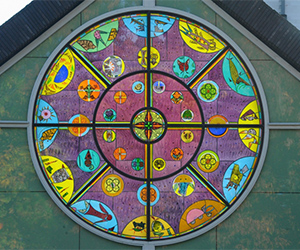
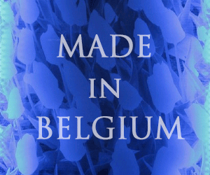
Udo Zembok: windows of the Cathedral of Paris/Cretell
|
|
|
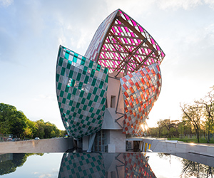
NEW BUILD CATHEDRAL OF PARIS/CRETELL
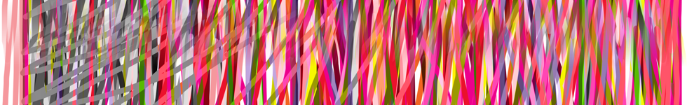
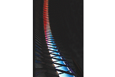
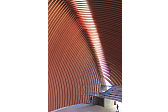
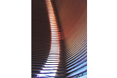
The architectural concept of two intersecting shell-shaped spatial forms celebrate a space which unfolds like a border along the interface of the two volumes. This space, designed as a glass ribbon, is the field of play for this commission. Spatially, the semi-circular arc opens up from east to west. As the only source of natural light the arc culminates at the zenith, vertically centred over the altar. At regular intervals, cross-section wooden ribs interrupt the continuous ribbon of glass.
|

|
Posted 23 January 2015
|
Share this:
|
|
Our artistic response to the given architectural shape is based on the idea that the incident sunlight artistically metamorphoses and thus should enter equally 'sublimated' into the sacred space. Paradoxically, however, light itself is invisible, because it is only perceptible to our senses when it reflects on material or flows through filters. Since Newton proved through his experiments with a prism that the components of light appear as colours, today three colours: red, green, and blue, describe the primary colours of light. When rays of light in these colours are bundled and mixed - an optical additive mixing - then the result is 'invisible' light, or if this is projected onto a surface, a 'white' light.
|
|
|
|
|
|
|
Udo Zembok: windows of the Cathedral of Paris/Cretell
|
|
|
|
|
|
|
Our design interprets this physical optic law of additive colour mixing for the specific positioning of the glass sheet and corresponds to the geo-spatial orientation of the building.
According to our analysis, the architectural specification required an artistic response, which can be read in the length of 55 meters of the arc as a unity.
Our proposal therefore used only the medium of colour as a means of expression; any form is reduced to a minimum.
Thus our colours evolve, starting from two basis points: ascending from the east and from the west two strands of colour culminate at the zenith. The point beginning in the east starts at the base with blue-green colours and rises up to turquoise-green shades on the border with the zenith area.
The Western base is in blue-violet tones, shading toward the interface with red-violet at the zenith.
This red part of the arch shades eastwards to red-violet and towards the west to red-orange shades.
|
|
|
|
The simplicity of the concept and composition opens up a range of different levels of understanding for the observant visitor.
The spectrum ranges from our delight in chromatic filtered colours and their effects on the interior architecture of the cathedral, to the concept of the three primary colours of light, their spatial positions and the symbolism of the Holy Trinity.
The language of colour is left free; the individual mental attitude of participating observer determines and meditates on the different possibilities and levels of experience.
The red at the zenith, one of the deepest colours, symbolizes God the Father, creative love and the divine creative fire, but also self-sacrifice and warmth.
The green in the East has from ancient times been associated with life and rebirth, the symbol of spiritual renewal. In the middle ages, green was the colour of doctors’ and pharmacists’ coats. Its quality is the expression of the resurrected Son of God, the healer and saviour.
The blue in the West stands for distance and eternity, the union with the Holy Spirit. In the history of art, blue is often the colour of Mary’s gown. “The Holy Spirit will come upon you, and the power of the highest will overshadow you” (Luke 1-35).
Menton, January 2015
concept: Udo and Pascale Zembok
artistic director: Udo Zembok
execution: Peter's glass studios, Paderborn
architects: AS architecture Studio, Paris
Correction: Christine Andersen, DK
|
|
|
|
|
|
|
|
Udo Zembok: Statement 2015 on his work
In my work, I demonstrate the powerful beauties of colour and light.
Colour is pigment, and colour is light.
Without light, no colour.
The basic optical law of refraction, where the light beam passes through a prism and produces the prismatic colours, first described by Newton, demonstrates this fact.
Rainbows are refractive images too.
We can match green, red and blue light, and the result is uncoloured ''white'' light. In scientific language, we call this phenomenon the additional synthesis of colour.
So, we see that light and colour are interdependent phenomena.
|
|
|
|
|
|
|
If a colour is light, pigment, and space, it also produces emotions in people's souls.
Beyond symbolism related to colour, which might separate people as of their cultural backgrounds, the perception of my large-scale colour installations featuring universal phenomena, attracts and unites people.
Our visual senses perceive the impact of colour is a universal language that speaks to people's hearts.
My public art projects, private commissions, and sculptures feature colour spaces including large-scale sculptural and architectural installations where the 'subject visitor' is invited to penetrate and perceive the environment of subtle colour and light experiences.
In order to identify or to enhance an expression, in some works I add the medium of writing as an additional artistic language.
For instance, the public commission of the underground car park, featured in my documentation, focuses the cardinal points via colour and writings. Celebrating these geographic directions, they appear declined in 7 European languages, sandblasted into the glass.
A second example is my proposal for a monumental public art project for the Farhang Foundation at an intersection of two Los Angeles boulevards, proposal that has not passed the final selection. I proposed to stack vertically 365 sheets of pigmented and tempered glass so that they form a solid cubic block (3,65 m x 3,65 m x 3,00 m). On many of these transparent blue sheets, were sandblasted dates representing important moments in the history of human rights in history. The 'subject spectator' would dive into a deep blue colour space where he would read, optically superimposed, the significant dates, like an image of a metamorphosis of time into space.
|
|
|
|
|
|
|